Timeline: 1 Month (Spring 2017)
Category: UX & UI Design
Type: Responsive Website
Tools: Pen & Paper, Sketch, InVision
Overview
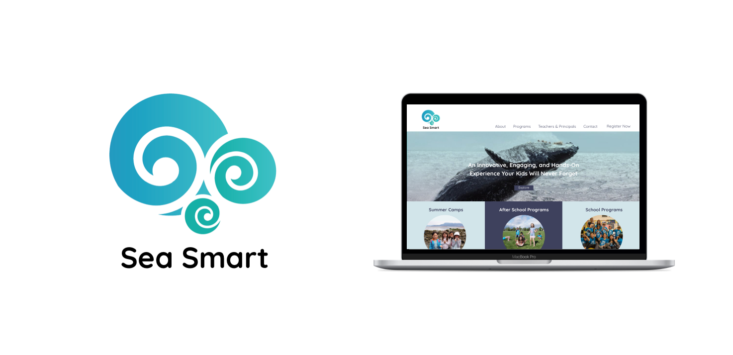
Sea Smart is an innovative educational school and summer camp that offers children a chance to learn about their local oceans and inspire youths to be environmental champions. The school is owned and run by a Ph.D marine biologist who has has conducted work all around the globe. Children who enrol in classes have the opportunity to get a hands on experience both inside and outside the classroom by playing games and other fun learning activities.
The Goal:
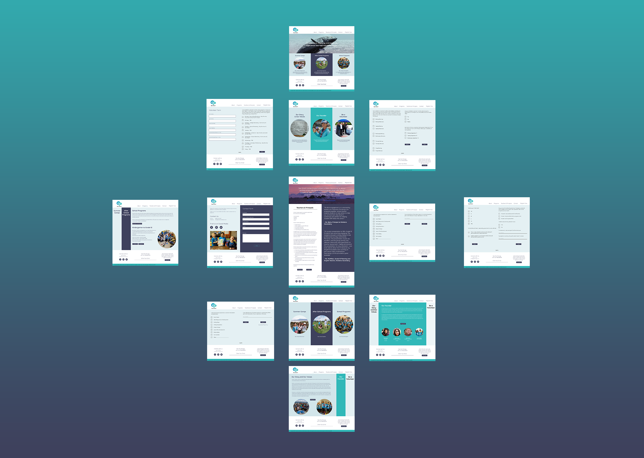
Our task with Sea Smart was to redesign their existing website to better educate their users about their services, program enrolment, payment and newsletter sign up. The most significant problem was that parents would begin the enrolment process but would leave along the way, not proceeding all the way to payment. Our second challenge was to optimize the newsletter sign up which was confusing to most parents resulting in lower engagement. For this project I was working with one other designer for our RED Academy community partner Sea Smart. We jointly worked on both the UX and the UI to make the mockups for this mobile responsive site.
Our path to achieving Sea Smarts goals were to refine the information architecture in order to create a clearer buying funnel, create a custom enrolment experience that was easy to complete, and finally simplify the newsletter sign up making it easier for people to become more engaged with Sea Smart.
Our primary goals were to increased registration in programs, re-enrolment, news letter sign ups and finally increase Sea Smart’s community engagement.
Research
The first stage in the process was to research summer camps and educational programs. We learned that there are over one hundred organizations in Vancouver that offer these services. We took the six most closely related businesses and created a comparative analysis. From this analysis and our additional research we found that the competitors strength lay in having an excellent public reputation. For example, the Vancouver Aquarium has the trust of many parents and is well known by many Vancouver residents. What was lacking from these reputable businesses was regular updates to their curriculum. This meant there was not much value in re-enrolling with one of these courses. Additionally, their programs were heavily based indoors and did not give the students an opportunity to actually go to the beach and learn hands on.
We then conducted in person and phone interviews to speak with parents and created an online survey that was sent out to Sea Smart’s mailing list. What we learned was that parents really just wanted an easy sign up process and for their children to be safe while they are away from home. Having their child learn and become genuinely engaged in the content of the course was just a bonus. With this information we wrote down each point of interest and created an affinity diagram which helped us to categorize our users main goals and interests.
Sea Smart’s competitors were showing their weaknesses by not regularly update their programs and thus had low re-enrolment value.
What we learned from parent interviews and our survey was that parents really just want an easy sign up process and for their children to be safe away from home
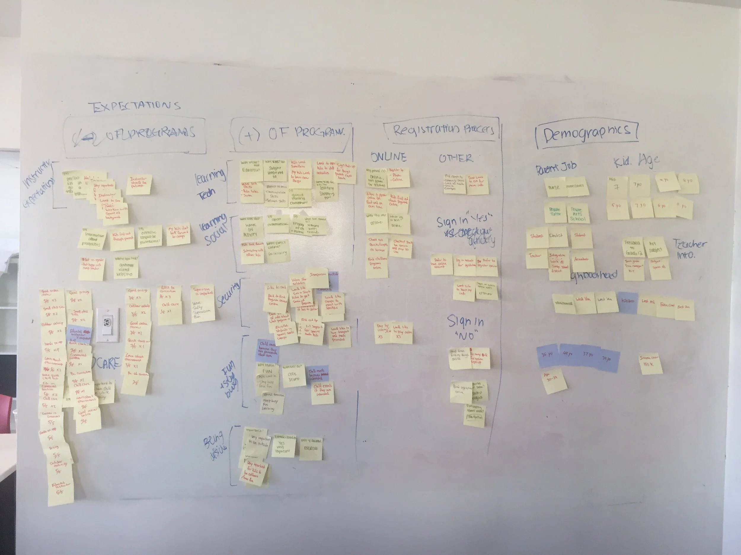
Affinity diagram for organizing users main goals and interests
Wireframing
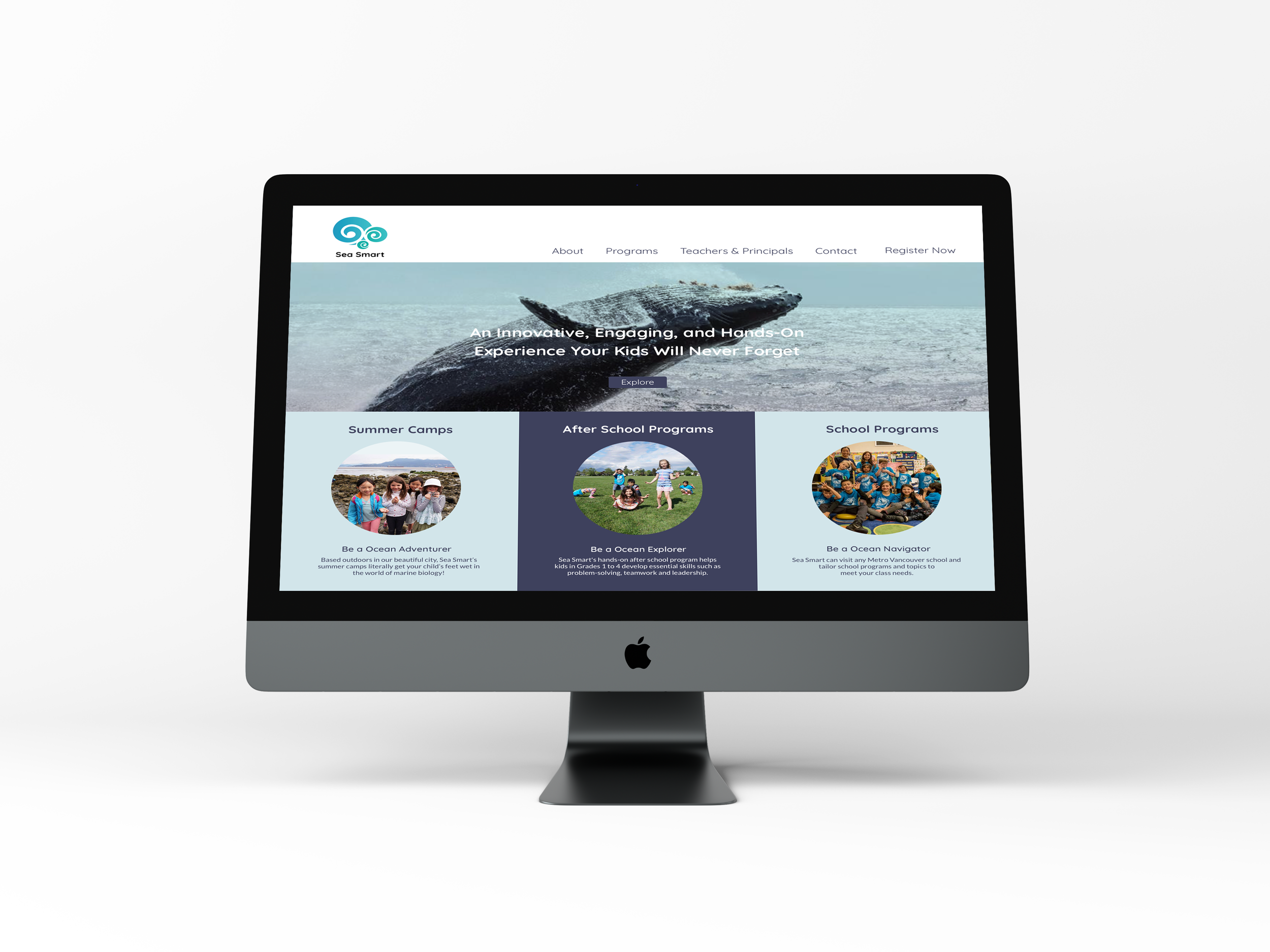
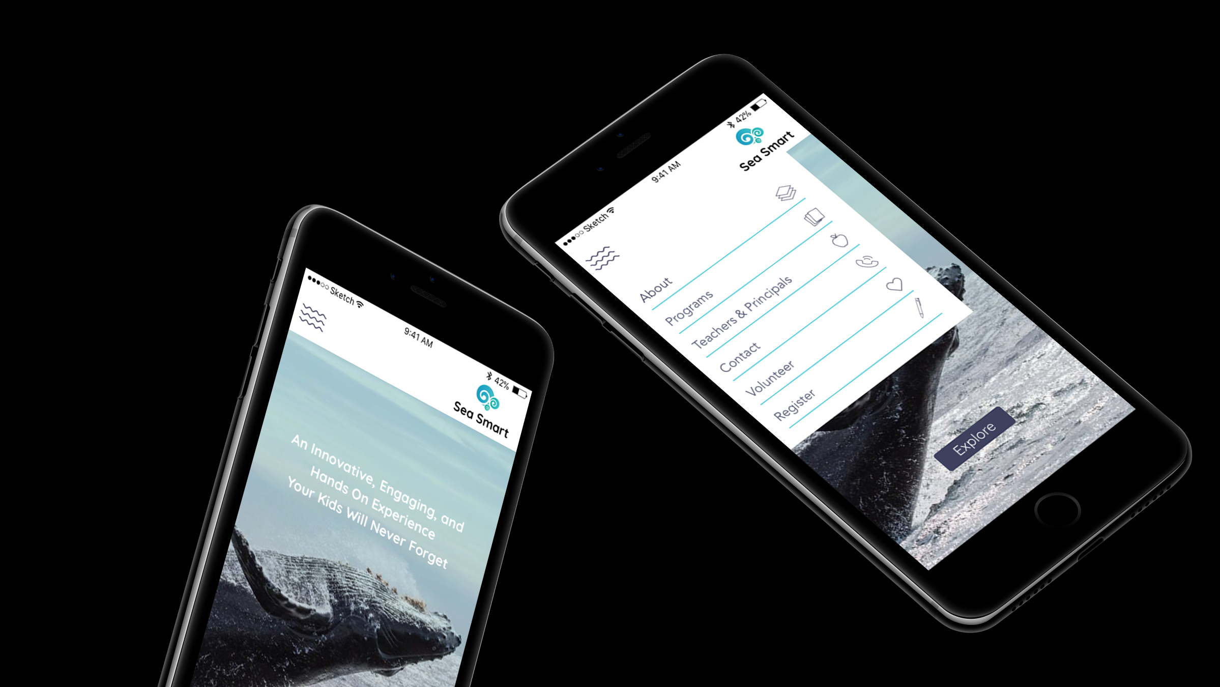
One of our biggest considerations when creating new wireframes for Sea Smart was to declutter and simplify the experience, specifically on the home page. The current home page had a bloat of features which caused users to get lost and not reach the primary objective of signing up for a class. As a part of this simplification we focused on having fewer but more prominent buttons that were more easy to notice. Currently, there are only 3 available program categories so we decided to have those as the main focus of the home page. Placing the programs clearly on the home screen means customers do not need to navigate through masses of information or click though multiple pages to explore each offering. We then added large titles for programs to capture attention and a large hero image to immediately engage customers as they enter the site. The navigation bar was also simplified and made easier to understand.
One of our biggest considerations when creating the new wireframes for the Sea Smart website, was to declutter and simplify the experience.
Currently, there are only 3 available program categories so we decided to have those as the main focus of the home page.
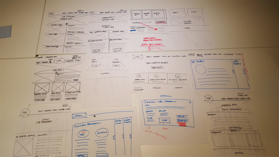
We closely examined the news letter sign up process as this was particularly confusing for many users. Sea Smart had multiple newsletters available which caused confusion as to which newsletter was most relevant. By tweaking the wording and organizing the sign up process we hope to increase successful sign ups in the future.
During our interviews we discovered that many parents wanted to see feedback from those who had enrolled their children in courses before. However, they reported that the testimonials on the Sea Smart site did not appear genuine. To combat this we removed the old testimonials and suggested that Sea Smart urges its customers to leave a review on their social media pages. These could then be featured on the site giving a more genuine impression. This would also drive people to Sea Smart’s social media pages increasing engagement. With these enhancements we found during testing with our peers that there were much fewer paths for users to get lost.
We removed old testimonials and suggested that Sea Smart urges its customers to leave a review on their social media pages. These could then be featured on the site giving a more genuine impression.
This would also drive people to Sea Smart’s social media pages increasing engagement.
UI
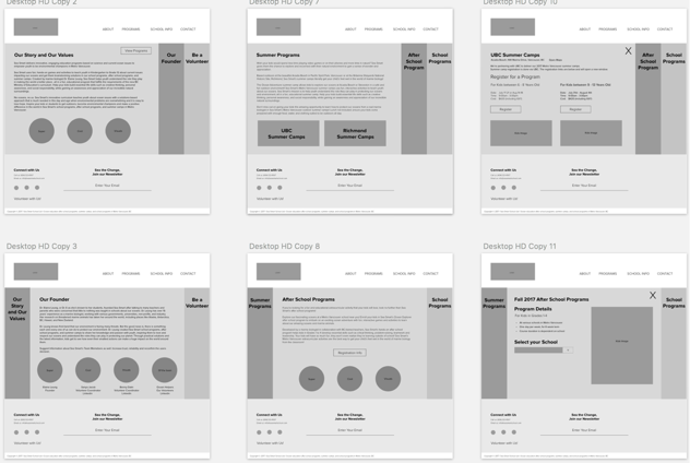
With the mid fidelity wireframes finished we began to work on the UI side of the project. Our client liked their current branding but was also open to expanding and developing their brand. We created multiple mood boards to present and after deciding on a direction with stakeholders we began to grow the brand within the wireframes. We wanted kids viewing the site to feel excited and inspired while also showing aspects of the course to parents.
We wanted any kids viewing the site to feel excited and inspired to be taking these courses while also showing aspects of the course to parents.
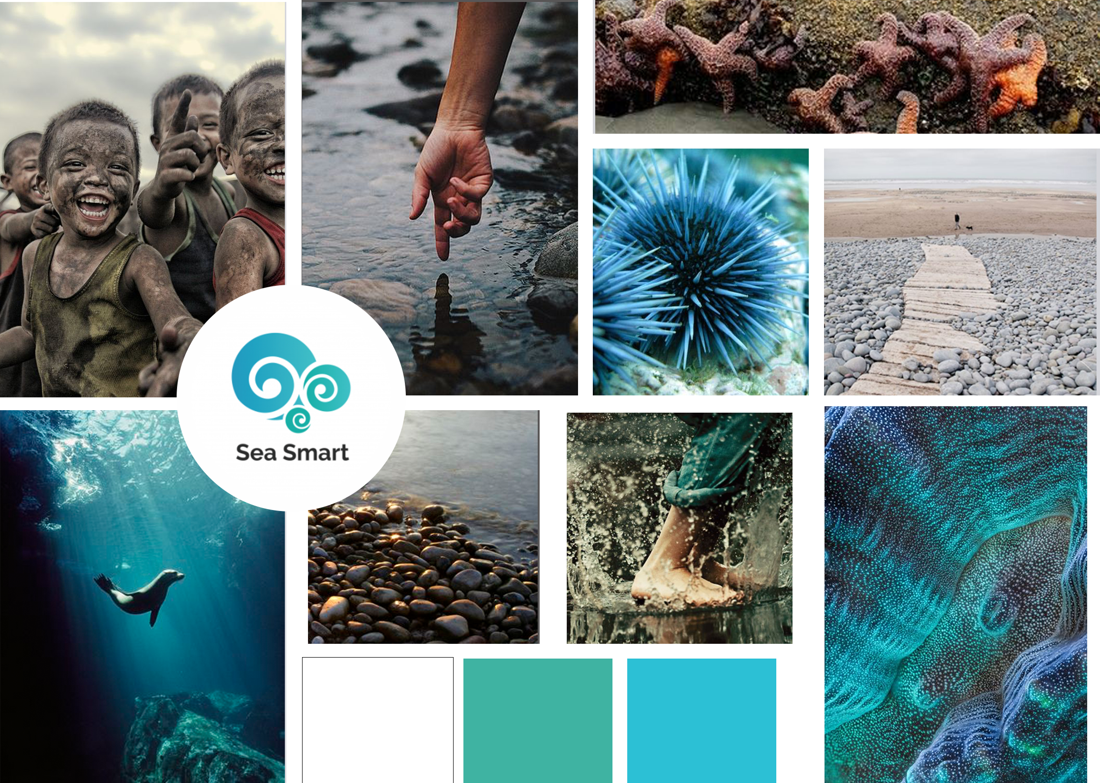
Mood board chosen by stakeholders
My takeaway from Sea Smart
This was the first project at Red that we had four full weeks to work on a community partner project. I found the extra week to be very helpful to fully understand the project and getting familiarized with each aspect of the company and the opportunities that we had.
To really make this project shine I would have liked to have had more time to test our high fidelity mockups with parents. I would have also loved to see this project developed however Sea Smart currently did not have the budget to make that a reality.
By refining Sea Smart's information architecture and created a clearer buying funnel, we designed a product that would make it easier for parents to get their child into a course and inspire them to be environmental champions in their own community.